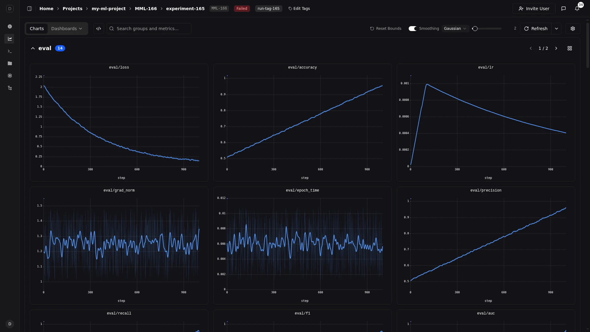
Logging
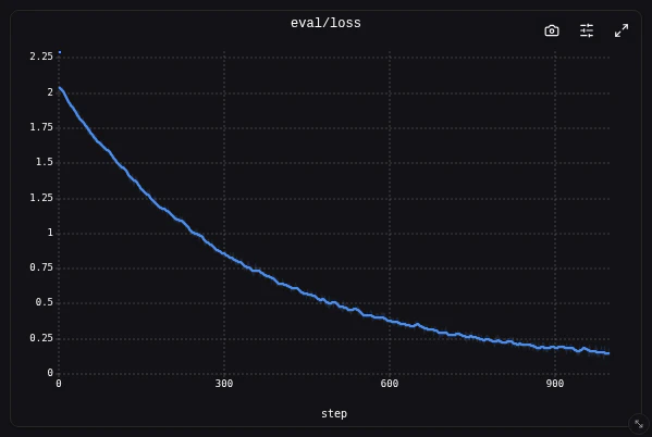
Line plots are ideal for plotting numerical data over time — losses, accuracy, learning rates, and similar metrics.Supported datatypes are
float, int, or torch.Tensor with a single value, or arrays of such.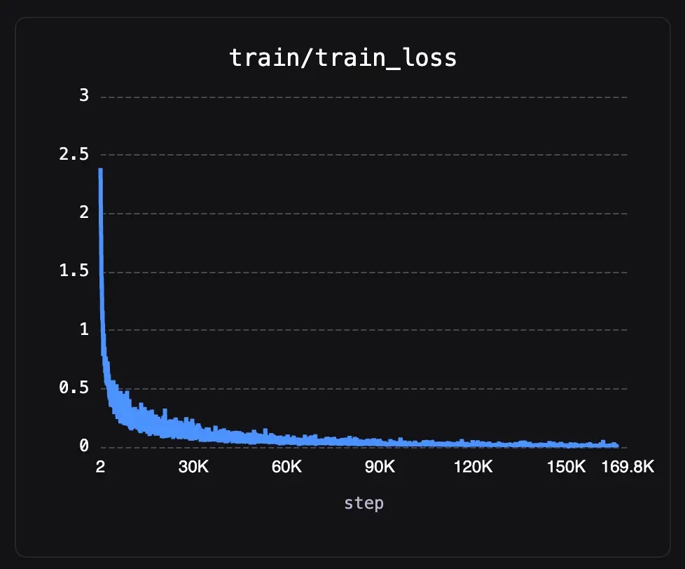
Viewing
Zooming
Pluto line charts support interactive zooming on both axes, letting you focus on specific regions of your data.X-Axis Zoom
Click and drag horizontally on any chart to zoom into a range of steps. All charts in the same axis group (e.g., all step-based charts) will synchronize their zoom level, so zooming on one chart zooms all related charts to the same step range.Y-Axis Zoom
Click and drag vertically on a chart to zoom the Y-axis. This is useful for focusing on a narrow value range, such as when losses are tightly clustered. Y-axis zoom is independent per chart — it does not sync across panels.Reset Zoom
Double-click on a chart to reset its zoom and return it to the full data range.Fullscreen View
Click the expand button on any chart’s toolbar to open it in fullscreen.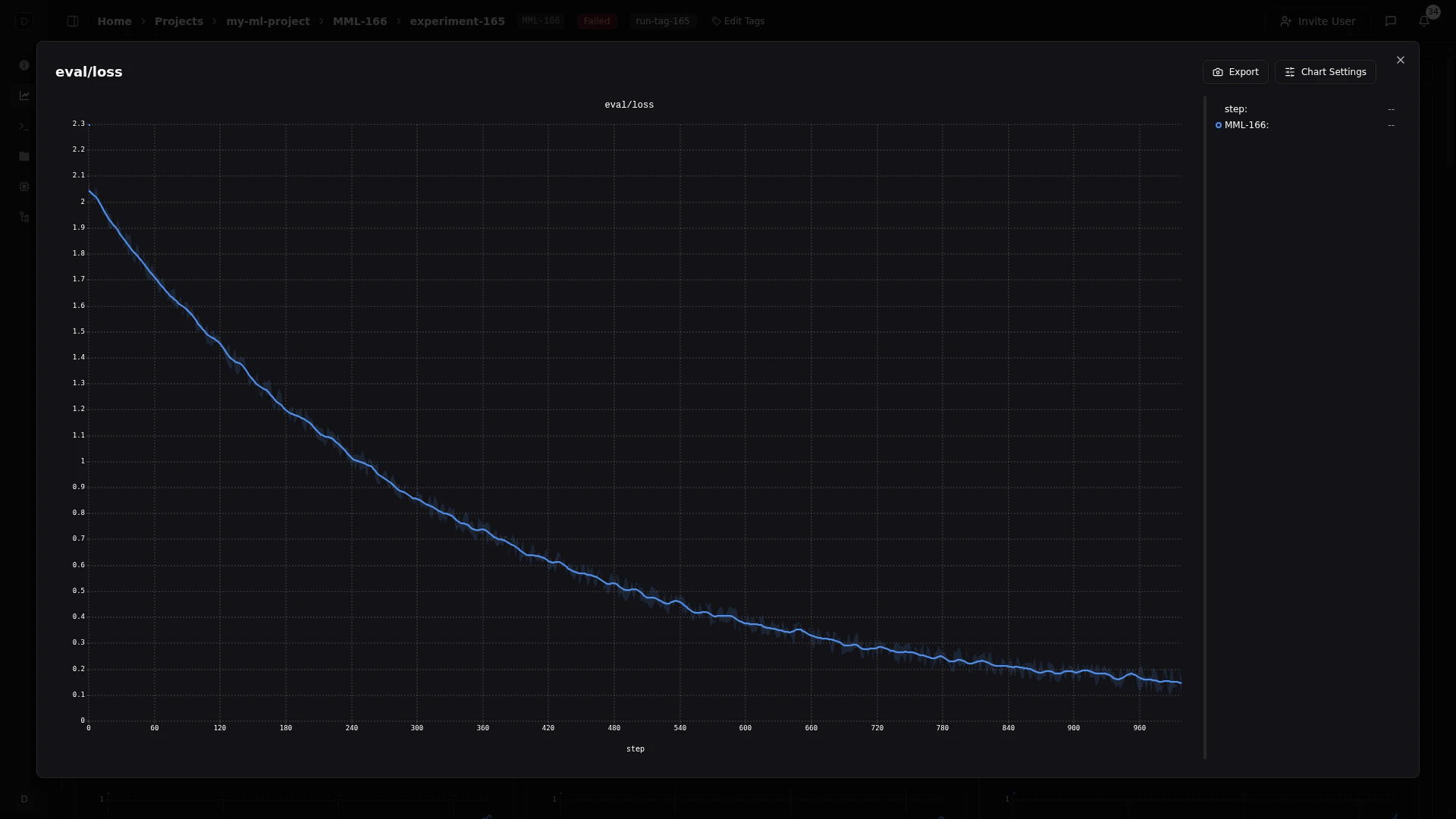
- A larger canvas for detailed inspection
- A resizable legend sidebar on the right showing all runs with color indicators
- Click any entry in the legend sidebar to toggle that series’ visibility — companion series (smoothing lines, min/max bands) toggle together automatically
- Export and Chart Settings buttons in the top-right corner
- The legend sidebar width is adjustable by dragging its edge, and persists across sessions
Tooltip
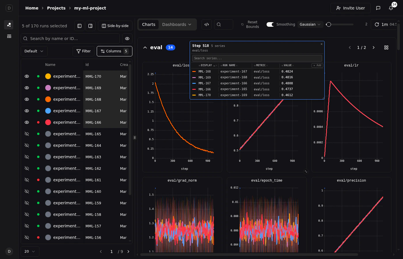
When hovering over a line chart, a tooltip appears showing the values for all visible runs at the nearest step. The tooltip can be pinned in place for hands-free inspection, customized to show exactly the columns you need, and searched to find specific series.Hovering
Move your cursor over any chart to see a floating tooltip with the current step and values for each run. The tooltip follows your cursor and updates in real time as you move along the X-axis. A vertical crosshair line indicates the exact step position.Pinning
Click anywhere on a chart to pin the tooltip at that step. A pinned tooltip:- Stays fixed in place while you scroll or interact with other charts
- Has a blue border to distinguish it from the hover tooltip
- Can be dismissed by clicking the close button (x) in the top-right corner
Only one tooltip can be pinned at a time. Pinning a new tooltip replaces the previous one.
Dragging and Resizing
Once pinned, the tooltip becomes fully interactive:- Drag the tooltip by its header to reposition it anywhere on screen
- Resize the tooltip by dragging the handle in the bottom-right corner
Searching Series
The pinned tooltip includes a search bar at the top. Type to filter the list of series by run name, display ID, or metric name. This is especially helpful when comparing many runs and you need to find a specific one.Customizing Columns
The pinned tooltip displays columns for each piece of run information. By default, it shows Display ID, Run Name, Metric, and Value. You can customize which columns appear:- Click the x button on any column header to remove it
- Click the + Add button to restore removed columns
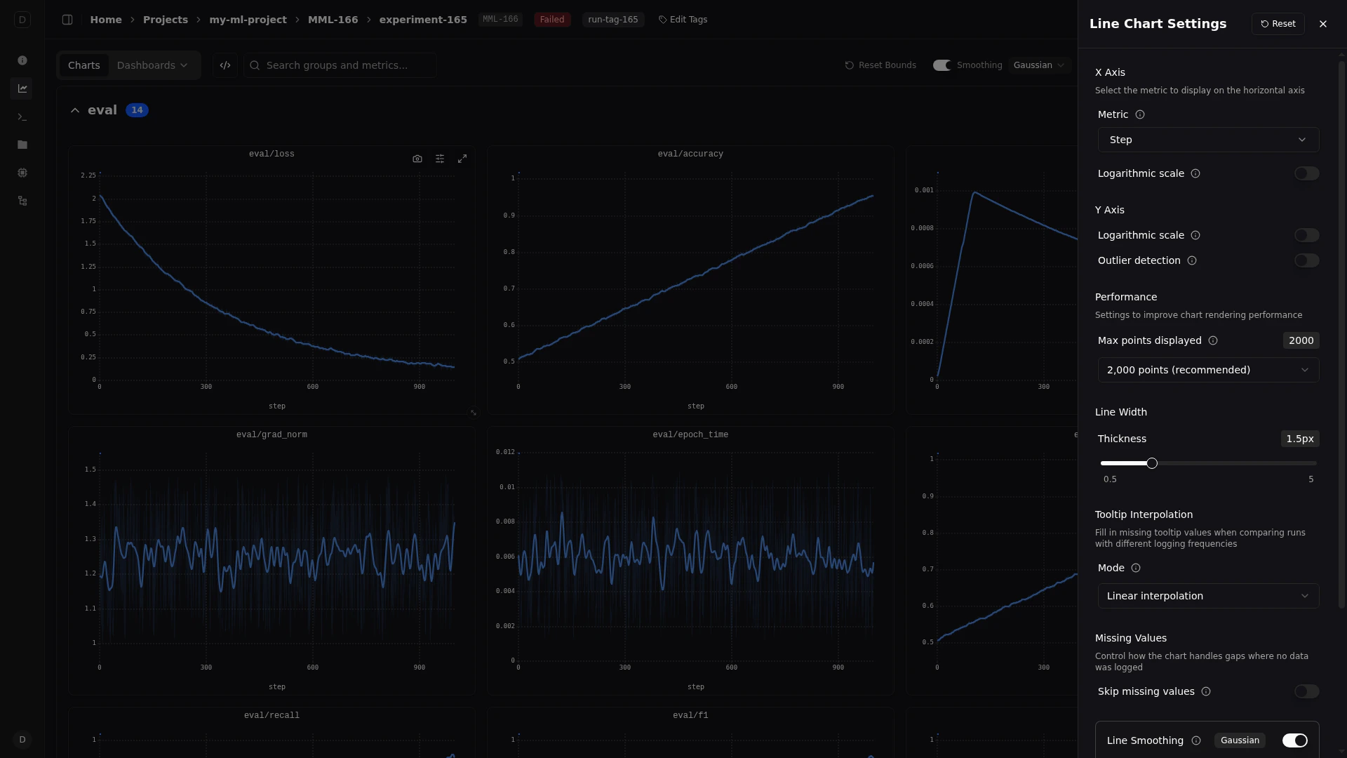
Chart Settings
Pluto provides two levels of chart configuration:-
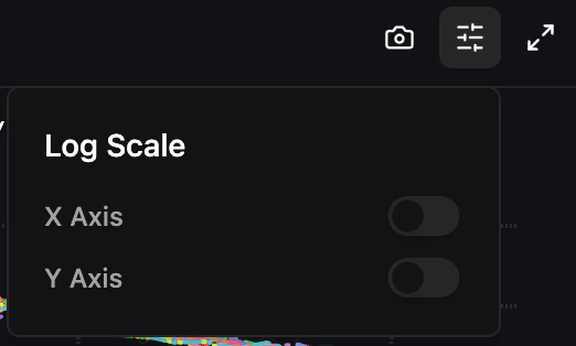
Per-chart toolbar — Hover over any chart to reveal three buttons in the top-right corner: an export menu (copy to clipboard or download PNG), a chart settings popover (log scale toggles), and an expand button (fullscreen view).
-
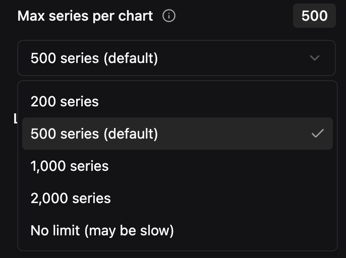
Line Chart Settings drawer — Accessible via the settings icon in the main toolbar. Configure global settings like X-axis metric, line width, max series, tooltip interpolation, and smoothing.
Export
Copy to Clipboard — Copy the current chart as an image directly to your clipboard for pasting into documents, Slack messages, or presentations. Download as PNG — Download a high-resolution PNG of the chart to your local machine.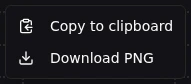
X Axis
Custom Metric — By default, charts use the step number as the X-axis. You can select any logged metric as the X-axis instead using the searchable combobox. This is available in both the line settings drawer and the dashboard widget configuration. Logarithmic Scale — Toggle logarithmic scaling on the X-axis.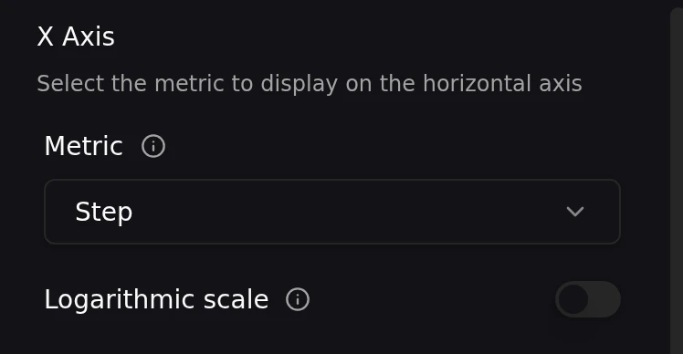
Y Axis
Logarithmic Scale — Toggle logarithmic scaling on the Y-axis. Outlier Detection — Toggle automatic outlier detection on the Y-axis. When enabled, extreme outlier values are excluded from the Y-axis range calculation, preventing a single spike from compressing the rest of your data into a narrow band.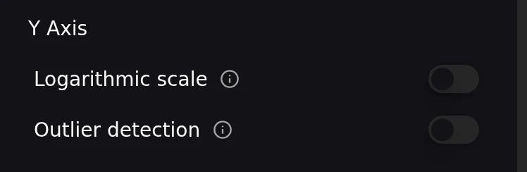
Line Display
Line Width — Adjust the line width using a slider that ranges from 0.5px to 5px (default: 1.5px). This setting is persisted globally across all charts.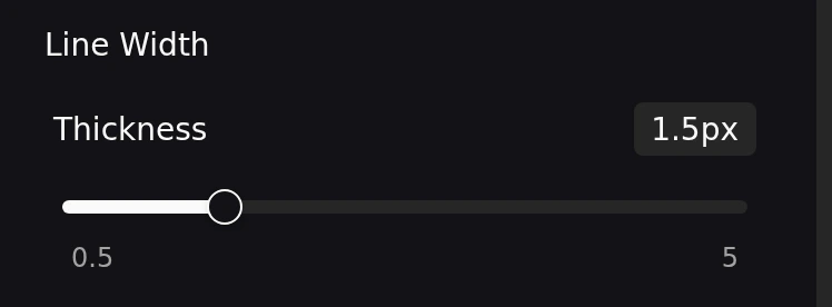
Interpolation
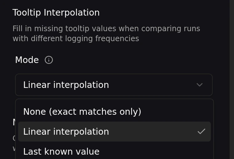
When comparing runs that log at different step intervals, the tooltip may need to estimate values between data points. You can control this behavior in the line chart settings drawer:- None — Only shows values at exact data points
- Linear — Interpolates linearly between neighboring data points
- Last known — Shows the most recent recorded value before the cursor position
Performance
Max Points Displayed — Control how many data points are rendered per series. Choose from preset options: 500 points (fastest), 2,000 points (recommended), 5,000 points (detailed), or all points (may be slow). The default is 2,000 points.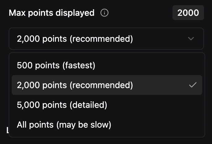
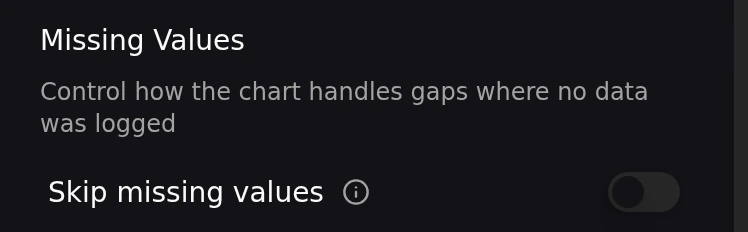
Step Deduplication
When multiple values are logged at the same step (e.g., from distributed training ranks or resumed runs), this setting uses the last-logged value per step instead of averaging all values. This eliminates artificial min/max spread in confidence bands caused by duplicate logging.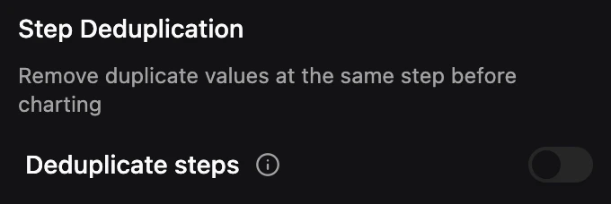
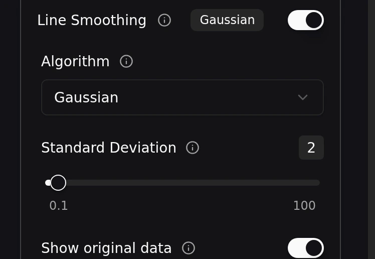
Smoothing
Smoothing helps you see the underlying trend in noisy metrics by applying a mathematical filter to the raw data. For details on smoothing algorithms and controls, see Smoothing.