Downsampling
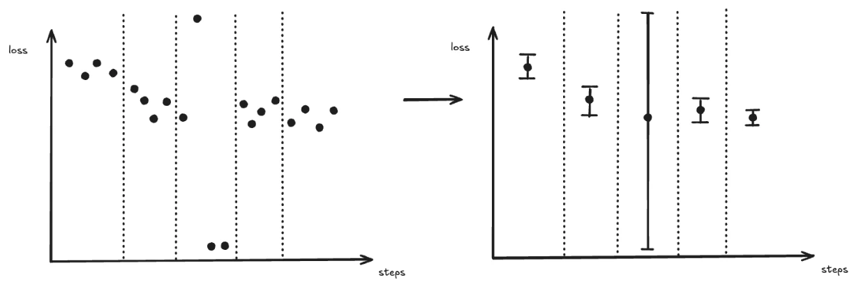
When a run logs thousands or millions of data points, transferring and rendering every point would be impractical. Pluto downsamples the data server-side before sending it to the browser, which keeps page loads fast, reduces bandwidth, and allows charts to render smoothly even for very long training runs. Instead of shipping raw data, Pluto divides the x-axis into evenly spaced buckets and reduces each bucket to a single plotted point. Two settings in the line chart settings drawer control that:
A bucket with no points in it is left empty — Pluto does not interpolate across gaps.
Resolution — How Many Buckets
Resolution defaults to Auto (screen-fit), which fits roughly one point per 4 pixels of chart width (clamped to 200–3,000). You can also pin it to High (500), Max (1,000), or Ultra (3,000) points per series. Lowering it produces a coarser summary; raising it preserves more detail at the cost of rendering performance. See Performance.Sampling — What Each Bucket Plots
A bucket usually holds many raw points, so Pluto must choose one value to plot for it. Sampling decides how.Average (with min/max envelope)
The default. Each bucket contributes:- Mean (AVG) — the plotted point
- Min / Max — a shaded band around the mean
LTTB (preserve spikes)
Largest Triangle Three Buckets plots a real logged data point from each bucket — picked to preserve the curve’s visual shape — rather than a computed mean. A one-step spike therefore survives downsampling instead of being flattened into its bucket’s average. Best when sharp spikes matter: gradient norms, learning-rate schedules. Both charts below plot the sametrain/grad_norm over 6,000 steps:
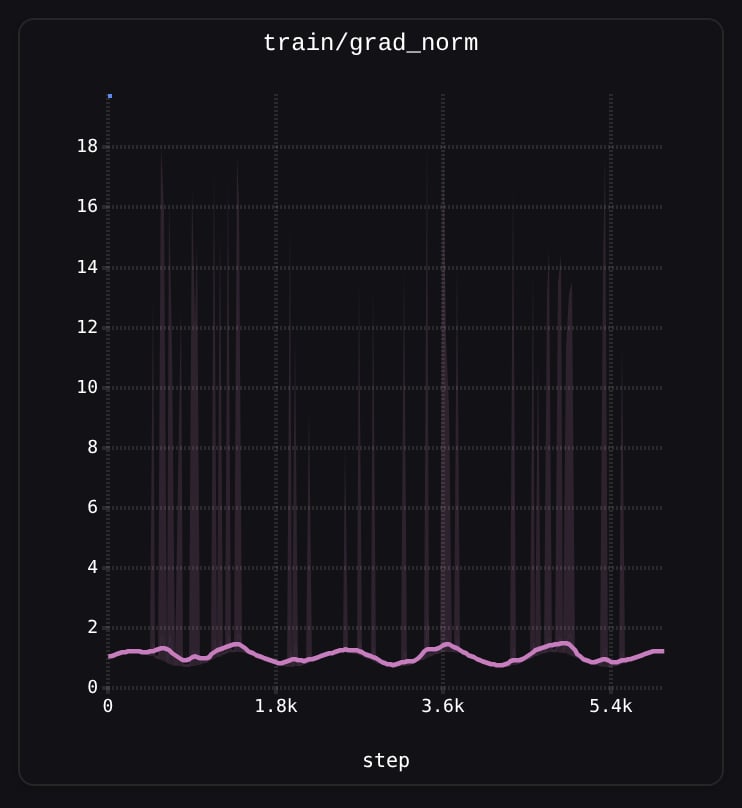
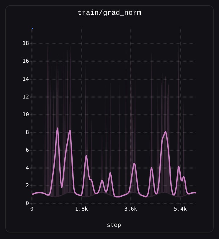
1.0 and the spikes appear only in the shaded band. Under LTTB (right) the spikes are real points on the line.
Sampling only changes which value a bucket’s point reports. The min/max band and the Min/Max tooltip columns are computed under both settings.
Min/Max Band and Outliers
In pluto, the shaded band around the mean line represents the min and max values within each bucket. This is particularly useful for spotting outliers — a spike that appears as a faint vertical band at full zoom can be revealed as an actual extreme data point when you zoom in.Screen-Aware Bucket Counts
Bucket counts are tied to the visible x-axis range. As you zoom into a region, fewer raw points fall within the view, so each bucket contains fewer points and the chart reveals more of the underlying raw data. At full zoom, you see individual data points with all their noise. Zooming back out re-aggregates the data into smoother buckets.Downsampling is applied before smoothing. The smoothing algorithms operate on the already-downsampled points, not the raw data.
Smoothing
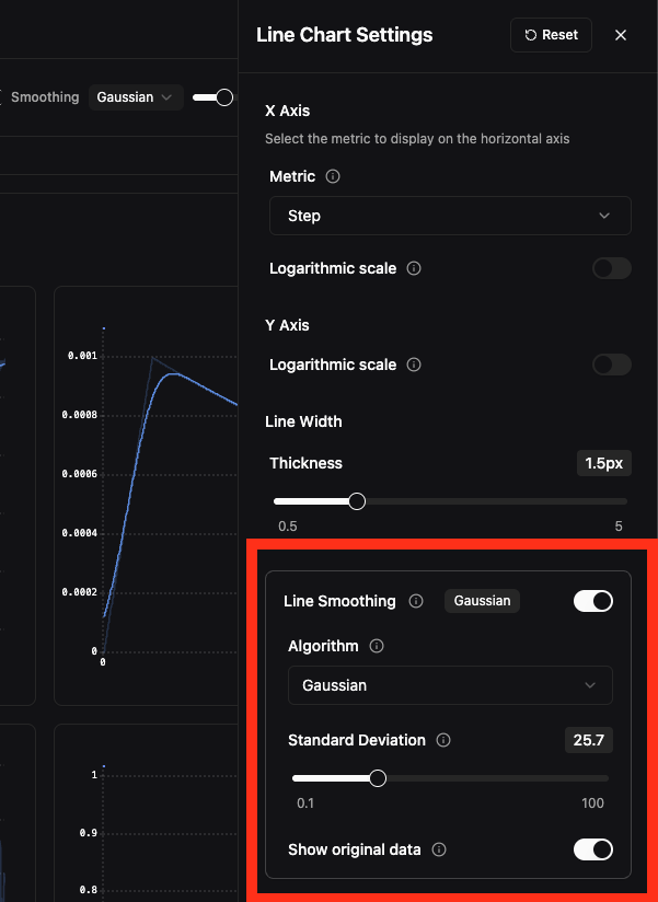
Smoothing applies a mathematical filter to reveal trends in noisy metrics. When enabled, the smoothed line is displayed prominently while the original raw data is shown faintly behind it as reference.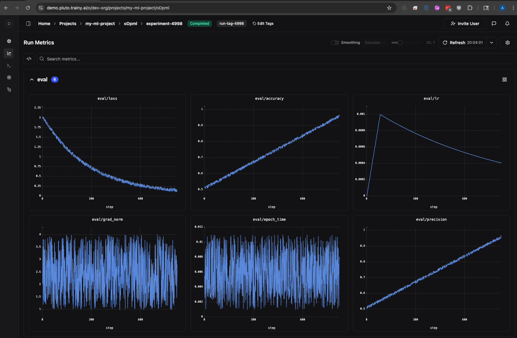
unsmoothed data
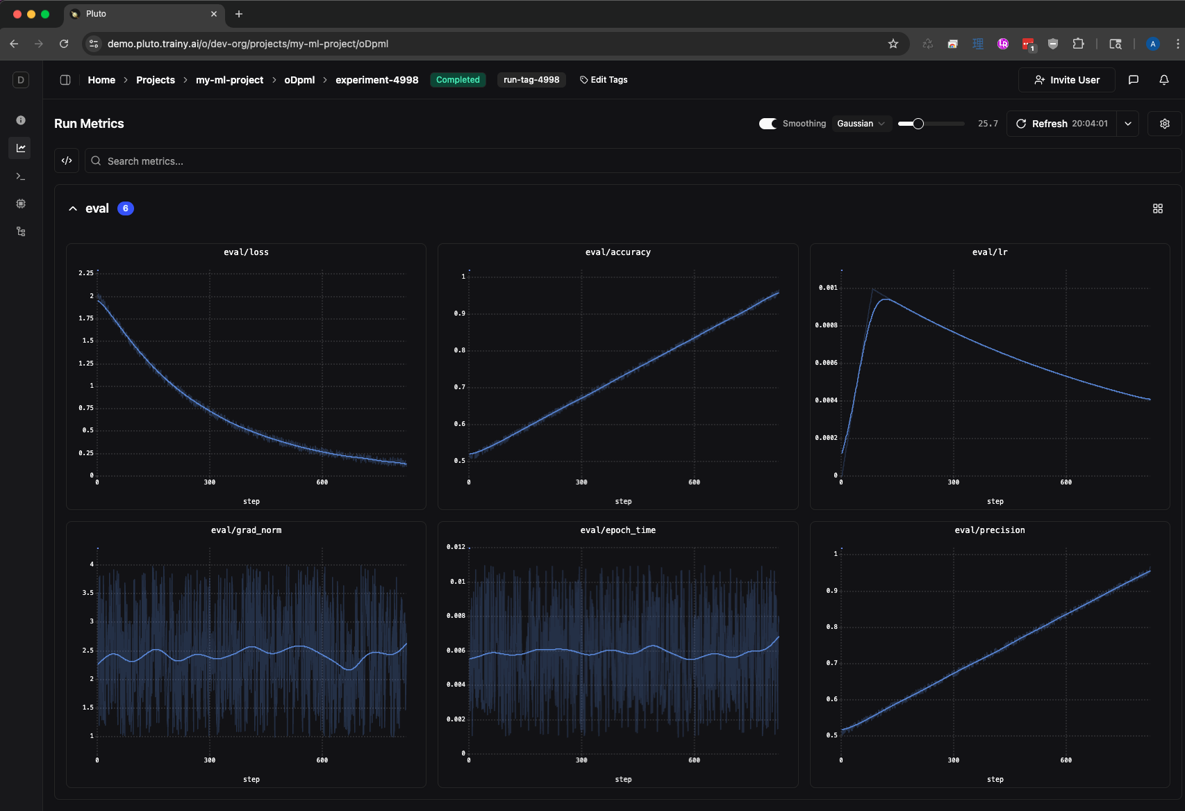
smoothed data
Enabling Smoothing
There are two ways to access smoothing controls: Settings Drawer — Click the settings icon in the chart toolbar to open the line chart settings drawer. The Line Smoothing section lets you toggle smoothing on/off, select an algorithm, adjust the parameter with a slider, and toggle visibility of the original data.