> ## Documentation Index
> Fetch the complete documentation index at: https://docs.trainy.ai/llms.txt
> Use this file to discover all available pages before exploring further.
# Comparing runs
> Co-plot metrics across runs and compare them in a side-by-side, git-style diff view.
## Metric Groupings
Metrics recorded with `pluto.log` produces a point in a time series, where each time series is associated with a user defined metric label. Every invocation of `pluto.log` is implicitly associated with a particular step value which represents the x-axis while the logged metric value is the y-axis. Metrics should be labeled using path like syntax i.e.
```python theme={null}
pluto.log({"val/loss": 2})
```
In the dashboard, metrics are grouped in the dashboard by their top-most parent key (in the example above, the topmost key would be `val`), and each panel corresponds to a unique full metric label path. In the above example, we've created a panel for the metric label `val/loss`
## Comparing Experiments
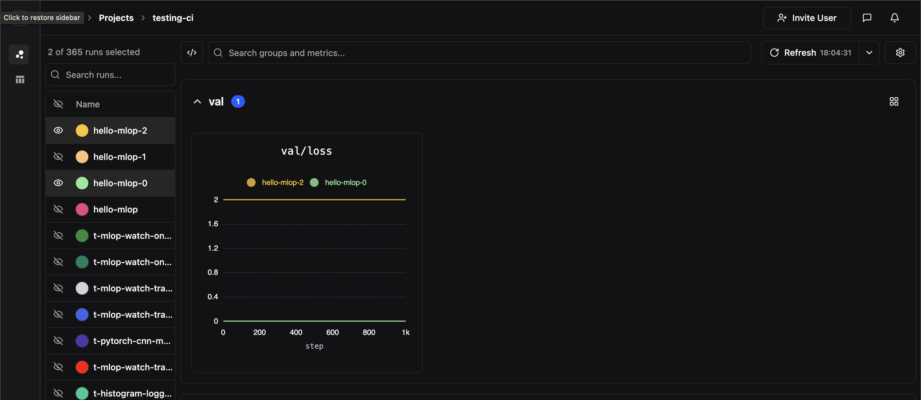
If two experiments have identically labeled time-series, their time series data will be co-plotted on the same panel. In the image below, we hide all of our experiments except for two which both contained time-series labeled `val/loss`
 The runs you compare here are the ones you select in [The Runs Table](/pluto/runs-table) — use it to filter, group, and pick the runs you want side by side.
## Side-by-Side View
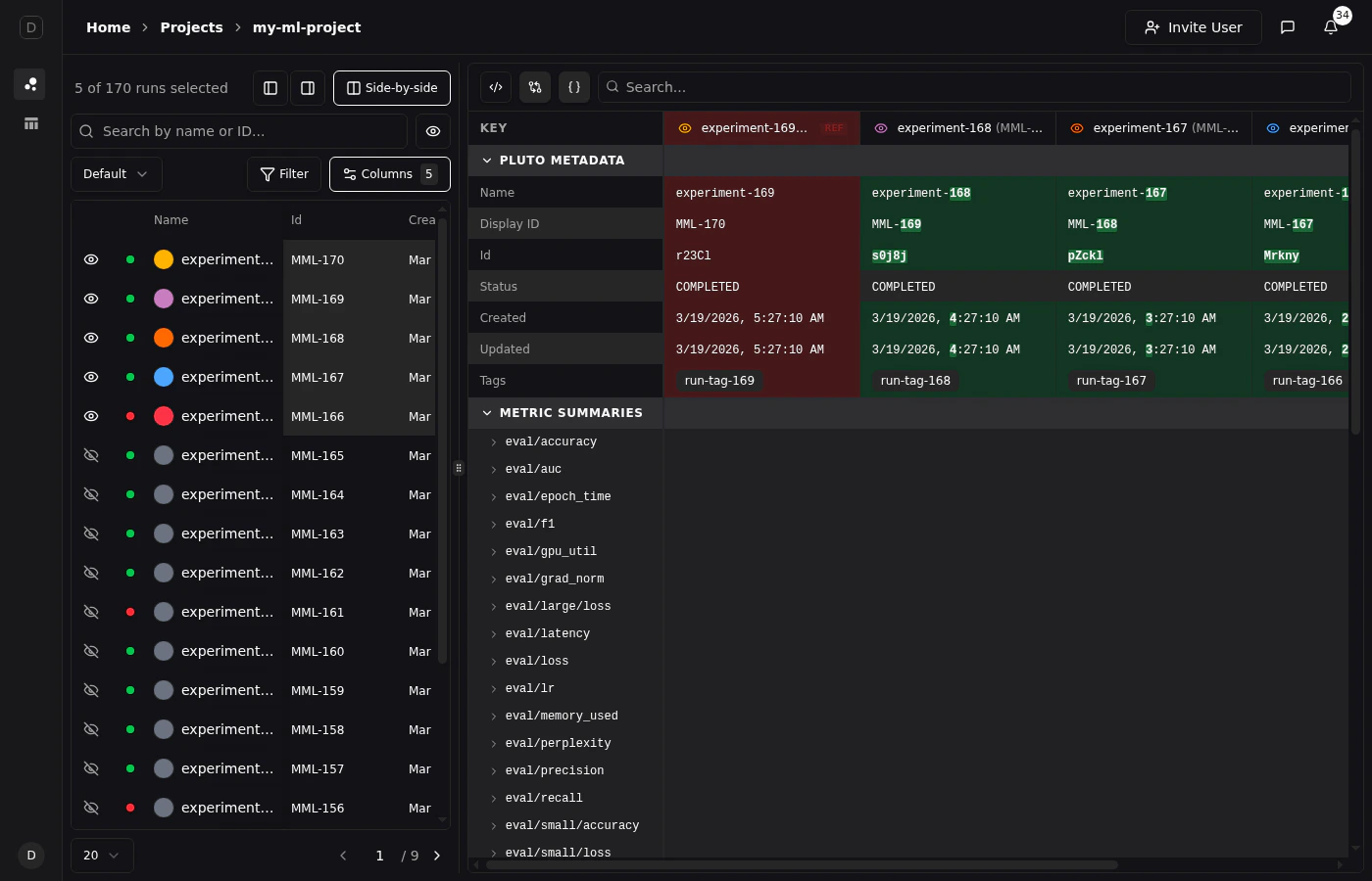
For a detailed tabular comparison of selected runs, click the **Side-by-side** button above the runs table. This opens a comparison view that displays all metadata and metric summaries in a structured table with one column per run.
The runs you compare here are the ones you select in [The Runs Table](/pluto/runs-table) — use it to filter, group, and pick the runs you want side by side.
## Side-by-Side View
For a detailed tabular comparison of selected runs, click the **Side-by-side** button above the runs table. This opens a comparison view that displays all metadata and metric summaries in a structured table with one column per run.
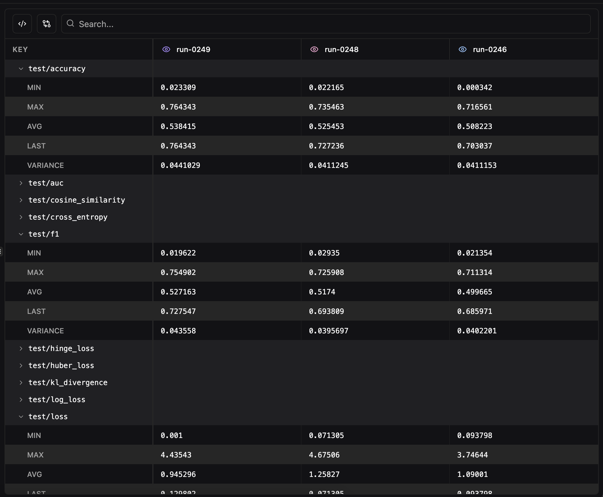 The side-by-side view includes:
* **Pluto Metadata** — Name, ID, status, owner, timestamps, tags, and notes for each run
* **Metric Summaries** — Final values for every logged metric, organized alphabetically
* **Search** — Filter the comparison table by metric name with support for regex matching
* **Remove from comparison** — Click the eye icon on any run's column header to temporarily hide it from the view
* **Show only differences** — Toggle to hide rows where all runs have identical values, making it easy to spot what changed between experiments
* **Format JSON values** — Toggle JSON pretty-printing for config values. JSON and Python dict values (single-quoted dicts, `True`/`False`/`None`) are automatically detected and formatted with collapsible cells. Enabled by default.
### Diff View
Click any run's column header to set it as the **reference run** (indicated by a "REF" badge). With diff mode enabled, values are highlighted git-style:
* **Red background** for the reference run's values
* **Green background** for values that differ from the reference
When both diff mode and "Show only differences" are active, the view also shows **word-level inline diffs** — individual words that were added are highlighted in green and removals in red, making it easy to spot exactly what changed within a config value.
The side-by-side view includes:
* **Pluto Metadata** — Name, ID, status, owner, timestamps, tags, and notes for each run
* **Metric Summaries** — Final values for every logged metric, organized alphabetically
* **Search** — Filter the comparison table by metric name with support for regex matching
* **Remove from comparison** — Click the eye icon on any run's column header to temporarily hide it from the view
* **Show only differences** — Toggle to hide rows where all runs have identical values, making it easy to spot what changed between experiments
* **Format JSON values** — Toggle JSON pretty-printing for config values. JSON and Python dict values (single-quoted dicts, `True`/`False`/`None`) are automatically detected and formatted with collapsible cells. Enabled by default.
### Diff View
Click any run's column header to set it as the **reference run** (indicated by a "REF" badge). With diff mode enabled, values are highlighted git-style:
* **Red background** for the reference run's values
* **Green background** for values that differ from the reference
When both diff mode and "Show only differences" are active, the view also shows **word-level inline diffs** — individual words that were added are highlighted in green and removals in red, making it easy to spot exactly what changed within a config value.